正在学习
15.1 INFORMAL EVALUATION METHODS
15.1 INFORMAL EVALUATION METHODS
There is a long tradition in economics for inspecting a model’s forecasting performance as a way of evaluating its usefulness and fit. Informal graphical methods were considered by Theil (1961), while more formal inspections of forecast errors were proposed by Mincer and Zarnowitz (1969), Fair and Shiller (1989, 1990), and Meese and Rogoff (1983). Wilson (1934) is an early example of forecast evaluation. See Stekler (1991) for a broad discussion of macroeconomic forecast evaluation techniques.
Informal methods for forecast evaluation often provide a good precursor to more formal methods and can be helpful in providing pointers to ways in which a forecast may fail. The main approaches to informally examine the “goodness of of a sequence of forecasts are graphical methods and decompositions of forecast errors. We first describe these before turning to more formal evaluation methods in subsequent sections.
15.1.1 Scatterplots and Time-Series Graphs
The most common graphical approach to examining closeness of forecasts and outcomes is a time-series graph which plots a sequence of forecasts and outcomes against the date where the forecast was made, t, or the date where the outcome was observed, t + h, where h > 0 is the (integer-valued) forecast horizon. Vertical differences between the two lines represent the forecast errors. Points in the sample where such differences are consistently of the same sign and/or unusually large indicate periods when the forecasts perform poorly and can be indicative of possible forecast breakdown. These graphs can, however, give a false sense of the performance of the forecast. When the predicted variable is highly persistent, simple autoregressive models will typically generate forecasts that appear to closely track the outcome, even though such forecasts might be relatively poor. For example, consider forecasts of stock prices which to a close approximation follow a random walk, so today’s forecast of tomorrow’s stock price is simply today’s stock price. This is not a particularly informative forecast—in fact, it carries no information about the direction of the future change in the stock price. A time-series plot of forecasts against actual values could disguise this because it can be difficult to read the typical size of the forecast error off these graphs. For less persistent variables, time-series plots can help identify obvious lead-lag relations between forecasts and outcomes.
GDP growth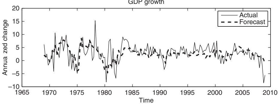
Inflation rate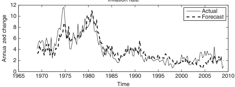
Figure 15.1: Time-series plots of actual values versus the Federal Reserve’s Greenbook predictions of next quarter’s GDP growth and inflation rate.
As an illustration of these time-series graphs, consider how the Federal Reserve’s so-called Greenbook forecasts relate to subsequent outcomes. The Greenbook forecasts are part of the Federal Reserve’s policy-making process and only get released after five years. Figure 15.1 plots the time series of one-quarter-ahead (h = 1) Greenbook forecasts of GDP growth and inflation against the actual values of these variables. Forecasts are smoother than outcomes, as one would expect if the forecasts reflect the conditional expectation of the outcome, but broadly track the level of both GDP growth and inflation.
Theil (1961) suggests several alternative graphical approaches to analyzing forecasts and their closeness to the outcome based on scatterplots of the sequence . First consider a scatterplot of the forecast against the outcome. The line represents the case where , so deviations from the line measure the size of the forecast error. With the forecast on the the vertical distance of any point from the line is the forecast error and so points above (below) this line indicate that the forecast underestimated (overestimated) the outcome. This scatterplot is useful for understanding the magnitude of the forecast errors, since the scale of the y-axis is measured in the same units as the outcome. It is also easy to glean the variation in forecast errors (deviations from the line) relative to variation in outcomes (variation along the y-axis). Cases where the outcome is difficult to predict and the forecast does not change much will show great variation in the direction of the y-axis and little variation along the x-axis. Cases where the forecast varies much more than the outcome give rise to the opposite situation with large variation in the direction of the x-axis and less variation along the y-axis. For example, nonlinear forecasting models sometimes generate extreme forecasts and these will show up as outliers along the x-axis. A third use of this type of scatterplot is that it can uncover new information about the direction of systematic over- or underpredictions. For example, a tendency to overpredict when the outcome is large will be seen as points in the top right corner of the scatterplot that lie systematically above the degree line. Finally, the outcome–forecast scatterplot gives an impression of the dispersion of the forecasts and whether this depends on the outcome variable or forecast. This can again be used to indicate ranges of the outcome variable for which forecasts are good versus ranges where they are poor.
Returning to the Federal Reserve’s Greenbook forecasts, figure 15.2 provides a scatterplot of the GDP growth and inflation forecasts against the outcomes. Although forecast errors at times are very large, there is clearly a strongly positive relation between the predicted and actual values of GDP growth. The relation between forecasts and outcomes is a bit more tenuous for the inflation series.
An alternative to the scatterplot of forecasts, against outcomes, , is to construct a scatterplot of the predicted change, against the actual change, . In this graph, the line still represents perfect forecasts, while the four quadrants now give an indication of directional accuracy. Points in the upper right quadrant (ordered around the show when the outcome is correctly predicted to increase. Similarly, points in the lower left quadrant show when the outcome is correctly predicted to decrease. The remaining quadrants show cases when the predicted direction is incorrect. Hence this graph decomposes forecast errors into groups based on directional accuracy.
As an illustration, figure 15.3 plots the actual versus predicted direction for the one-quarter-ahead Greenbook data, i.e., plotted against . A positive relation here indicates that the Federal Reserve has the ability to predict whether GDP growth or the inflation rate is rising or falling. Again, a strong positive relationship emerges for the GDP series. While the correlation is also positive for the inflation rate series, the relation is clearly weaker.
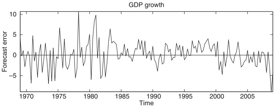
Other plots can be based on forecast errors, . For many loss functions, a simple transformation of the forecast error should be unpredictable. For example, under squared error loss, the forecast error should have a zero mean and be serially uncorrelated. This means that the time series of one-step-ahead forecast errors should not display periods with persistent negative or positive values. We illustrate this property for the Greenbook forecasts of GDP growth and the inflation rate in figure 15.4. While there is no obvious evidence of persistence in the forecast errors for GDP growth, the forecast errors appear to be serially correlated for the inflation series.
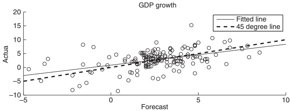
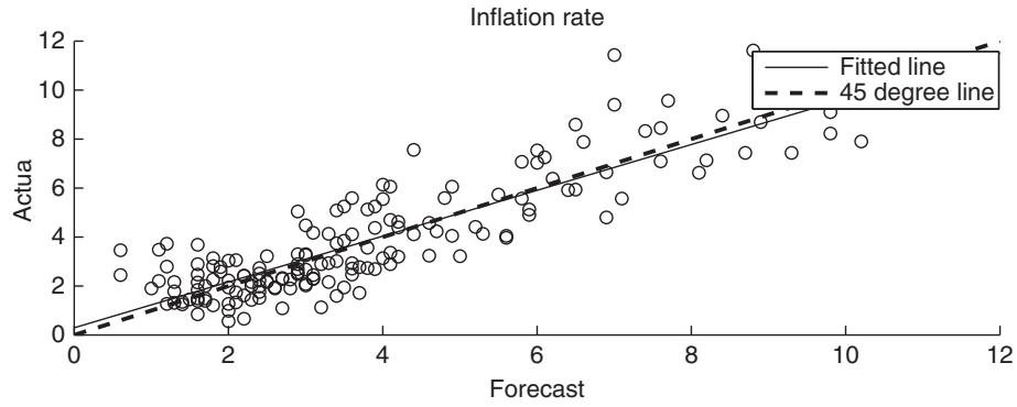
Figure 15.2: Scatterplots of actual values versus the Federal Reserve’s Greenbook forecasts of next quarter’s GDP growth and inflation rate.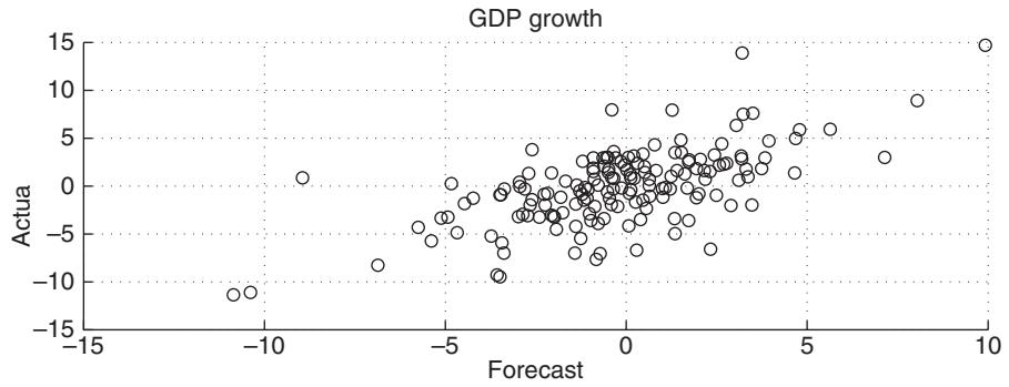
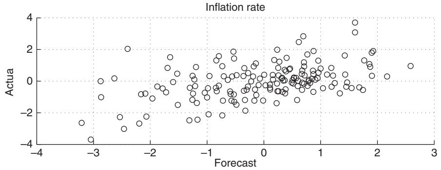
Figure 15.3: Scatterplots of changes in actual values versus the Federal Reserve’s Greenbook forecasts of changes in next quarter’s GDP growth and inflation rate.
Inflation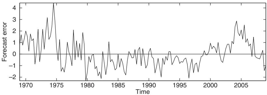
Figure 15.4: Time-series plots of one-quarter-ahead forecast errors (actual value minus the Federal Reserve’s Greenbook forecast) for GDP growth and the inflation rate.
A density plot of the forecast error distribution can also be used to uncover evidence of bias, particularly if the distribution is not centered close to 0. As an illustration, figure 15.5 shows kernel smoothed plots of the densities for GDP growth and inflation rate forecast errors. While the density of the inflation rate forecast errors peaks at a negative value, the distribution is clearly right-skewed.
练习题
Which of the following is NOT a reason for evaluating forecasts according to the source material?
What are the main approaches to informally examine the 'goodness of fit' of a sequence of forecasts?
Time-series graphs can always provide an accurate representation of forecast performance.
The vertical differences between the forecast and outcome lines in a time-series graph represent the ___.
Explain the usefulness of scatterplots in forecast evaluation.
Which of the following is a limitation of time-series graphs in forecast evaluation?
What can scatterplots reveal about forecasts that time-series graphs cannot?
For less persistent variables, time-series plots can help identify lead-lag relations between forecasts and outcomes.
The line in a scatterplot represents the case where , so deviations from this line measure the size of the ___.
How do the Federal Reserve's Greenbook forecasts relate to actual values according to the source material?
When evaluating forecasts using time-series graphs, what is a key limitation to be aware of when the predicted variable is highly persistent?
Which of the following are true about scatterplots used for forecast evaluation? (Select all that apply)
Explain how time-series graphs can be misleading when evaluating forecasts of highly persistent variables, and suggest an alternative graphical method that might provide more insight.
登录后解锁笔记、知识点解析、AI 问答
立即登录